Is Color an Intoxicant?
I had the pleasure of viewing two exhibits here in Santa Fe recently by two accomplished abstract artists. Polly Barton’s exhibit Seduced at Gebert Contemporary (formerly Chiaroscuro Gallery) on Canyon Road ended today. Emmi Whitehorse’s exhibit Intimate Landscapesis on view at the Wheelwright Museum of the American Indian through October 3, 2026. The current exhibit is actually Part II, focusing on “Line and Form” and featuring work from 1990-present. (Part I, “Light and Space,” showed work from the 1980s-2000s.)
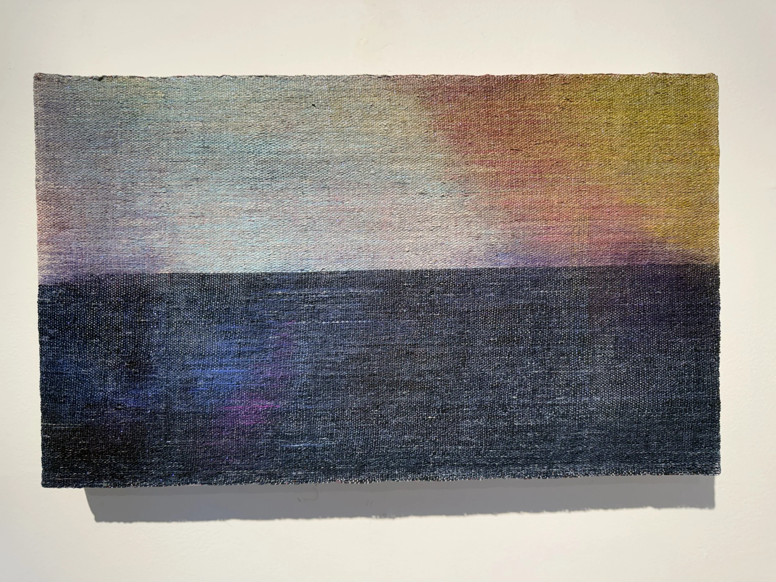
Polly Barton, Starlight Inhaled #1. Mixed media: silk warp painted with natural inks, soymilk and pigment, ikat weft. 11.5'“ × 19.5”
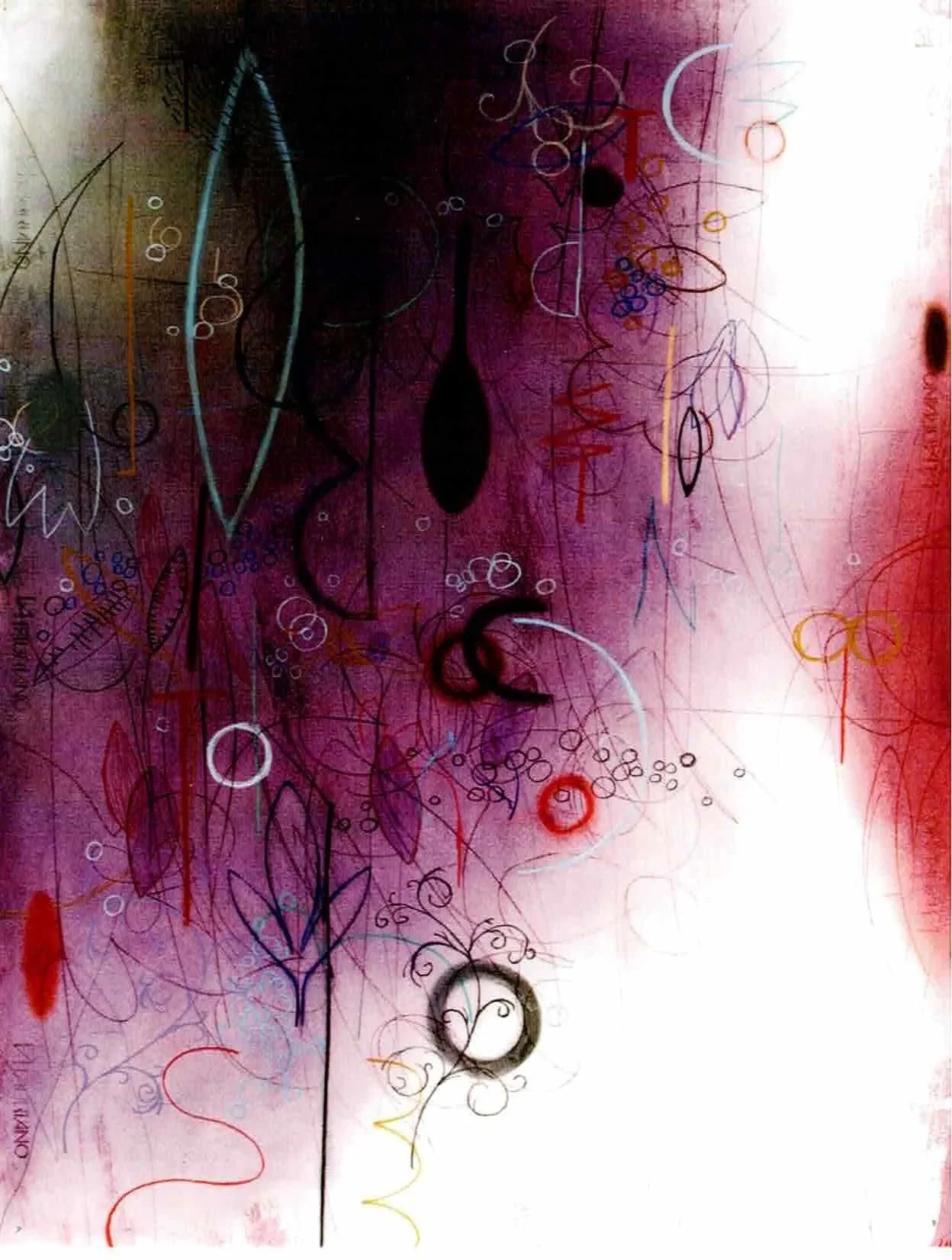
Emmi Whitehorse, Night Journey. Oil pastel, chalk and paper on canvas. 40.5” x 28.5.”
It is immediately clear to the viewer that both artists are seduced by color and both are intrigued by mark-making on fields of color. Whitehorse’s fields of color and marks are painted with oil pastel and chalk on paper (occasionally incorporating conté, pencil, and collaged paper) which is mounted on canvas. Barton shows three woven pieces mounted on canvas that demonstrate her unparalleled mastery of ikat dyeing and weaving. But the bulk of Barton’s show is works in pastel on paper, with hand-stitched marks in metallic thread. While both artists employ mark-making on fields of gorgeous color, their works have different impacts.
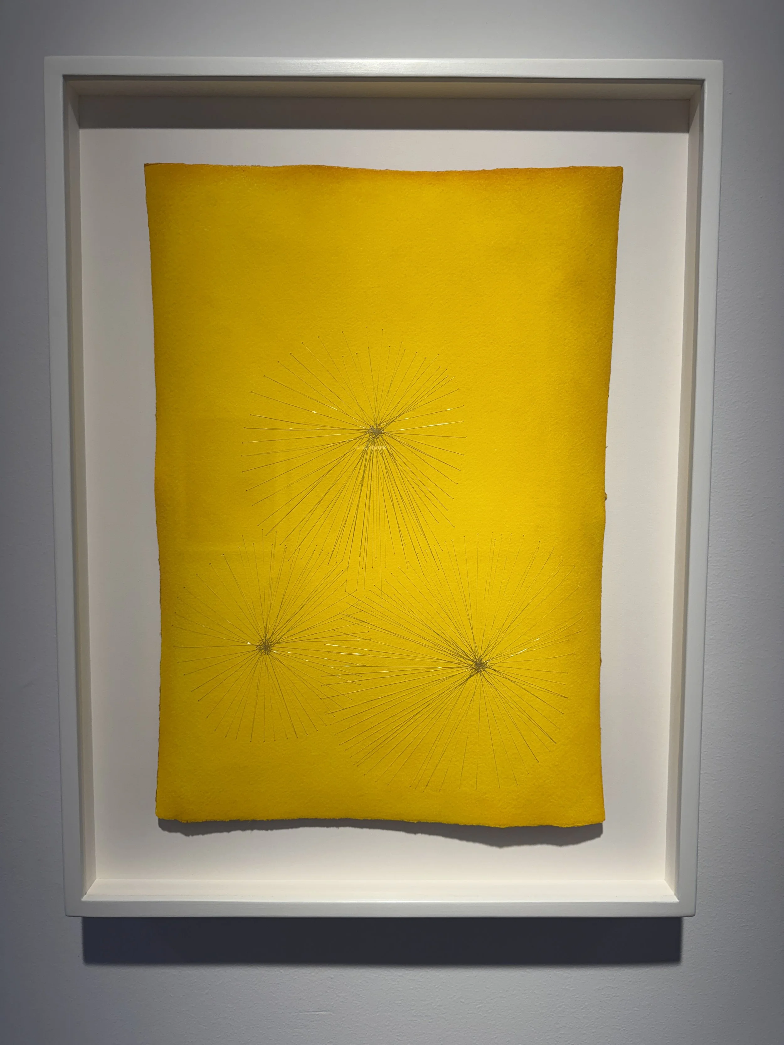
Polly Barton, Blowing Silver. Pastel on paper with stitched metallic Japanese monofilament. 16.5” x 11.5”
In wall text and the exhibit catalog, Whitehorse stresses that her work is rooted in the land and in natural elements and forms. Her marks form a uniquely rich personal vocabulary and are not usually representational, but they are based on things like cells, seed pods and leaves. Curves abound. There are multiple layers of color, marks imposed and rubbed out and further marks and shapes superimposed. The paintings have depth. The color fields are generally monochromatic, or nearly so, with gradations from light to dark that contribute to the illusion of deep space. For me her works have a dream-like quality, inducing the kind of floating consciousness that you might experience while walking in a meadow or a forest, gazing into a fire, or looking into a pond. For a deeper look at Whitehorse’s work and process, check out this beautiful short video.
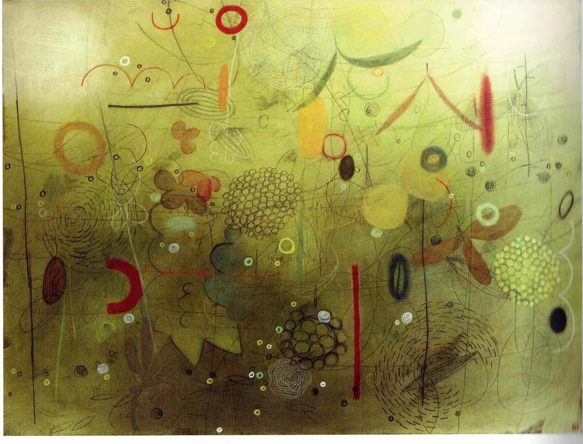
Emmi Whitehorse, Prickly Pear. Oil pastel, chalk, and paper on canvas. 40” x 51”.
Barton’s color fields are constructed with layers of color that pack a powerful punch. At first glance the pieces appear to be monochromatic, but a closer look reveals subtle variations in hue or value that lend the paintings some depth. The color extends all the way to the edges of the paper. In some works, Barton has painted the back of the paper in a complementary color that is reflected off the white mounting board behind the painting, casting a distinctly contrasting shadow or kind of after-image. Magical!
The complexity deepens with the stitching: long, straight, shimmering stitches that form mysterious abstract shapes. In some pieces the shape or shapes are limited to one section of the painting, while allowing the color to sing unobstructed in the rest of the work. In other pieces the stitching covers the paper, or might form a more or less centered focal point. “Pussy Willow” features a centered, plant-like form and the words of the title above and below.
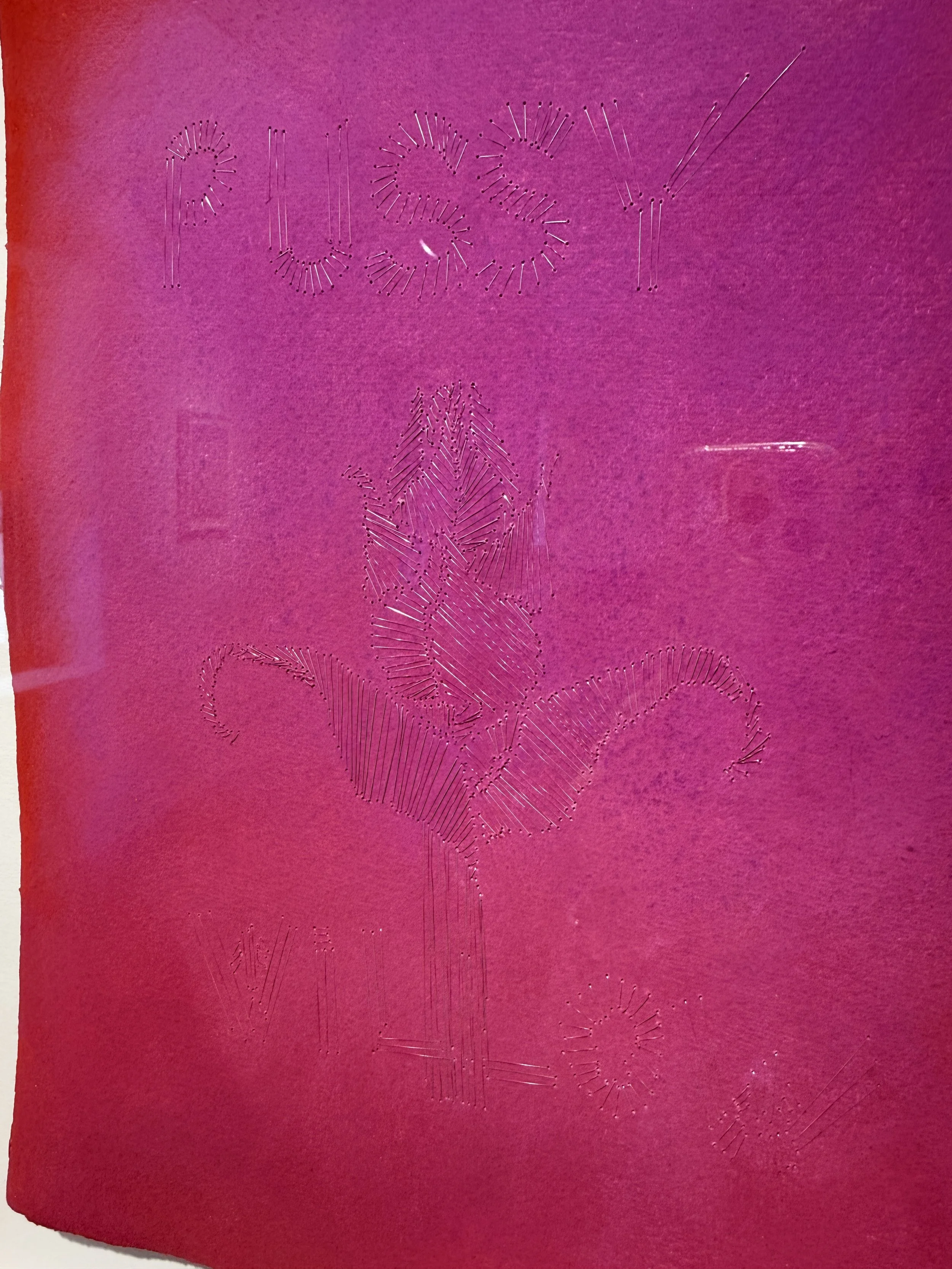
Polly Barton, Pussy Willow (detail). Pastel on paper with stitched Japanese monofilament. Framed, 21” x 16” x 2”. Please pardon unavoidable reflections.
I’ve noticed that many of us, me included, are absolutely seduced by color. We gravitate to works with deep, pure, suggestive hues. Sometimes we even call it “eye candy.” For many of us, it’s hard to separate the impact of an artwork from its use of color. But for those of us like my dear husband, photographer Sam Elkind, who are color-blind, color is much less impactful. For Sam, it’s the gradations and contrasts of value that are entrancing, and the interaction of line with tone. Of course Whitehorse and Barton are also exploring this interaction in their work, with marks on fields of color.
How important is color in your own work, or in the work you are drawn to? As you ponder it, can you go beyond simple attraction to your favorite color and analyze more specifically how and where color intoxicates you?